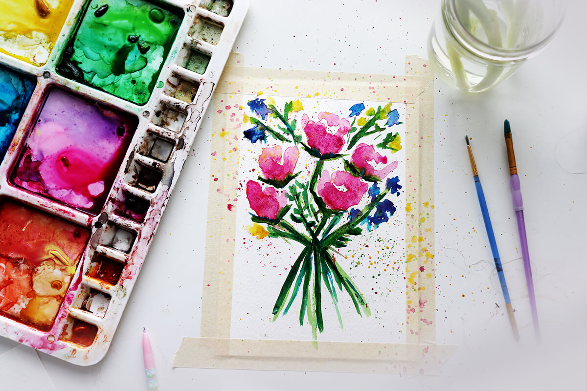
Out of those colors, you can eliminate one of the green's. Start with Hooker's Green. It's a cool green and can be "warmed up" by adding one of the yellows to it.
I have multiple yellows because as a primary color, it's much harder to get the base yellow I'm looking for.
The colors I use more often (20% of the time) include raw umber, sap green, yellow ochre, orange (opangue) cadmium red (medium or light hue), purple. And I can figure out to make these colors. I'll have them in my palette for convenience, i.e. I'm feeling a bit lazy to mix them up 😊
Lemon yellow is an opague, while yellow ochre and cadmium yellow are translucent colors.
Here's the secret. It's actually a two-parter.
First, every artist doesn't like their work at some point in the process! Almost every piece I've ever done goes through, "What-was-I-thinking-this-is-the-worst-ever."
Second, the secret to fixing perceived mistakes is adding layers with pen and ink, then adding another layer of watercolor.
Check out the free workshop here to have a look at how we transform a mediocre watercolor painting into a lovely, "delicious" piece.


